Educate Girls Logo Inspiration
One area I have a fondness for, probably because I’m a girl mom, is women’s and girl’s empowerment, and since I’ve been looking at a lot of organizations that work in that arena, I thought I’d share one of my favorite logos.
In case you forgot, an effective logo is
simple | memorable | timeless | versatile | appropriate
EDUCATE GIRLS LOGO
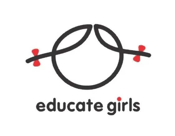
This logo immediately struck me. It’s for a non-profit that focusses on girls’ education in India’s rural areas.
I love how the designer created a mark that is unmistakably a girl with just one line and two little bows. The oh-so-slight curves of the “pigtails” and different sizes of the “hair” sections, gives it a sweetness that is incredibly endearing.
The copy is a simple sans serif in lower case, which is appropriate for an organization dedicated to youth, and the dark grey and bright red color palette is simple, striking, and fun. I love how they reinforced it with the red dot over the “i”.
I also love the 12 years graphic (pictured below). It works well with the logo and infuses a “hands on” feel to the branding. I wish they’d used it more throughout their website, which, honestly, is not quite as fabulous as their logo is.
