9 Important Typography Tips for Sensational Design
I love typography about as much as I love color. Some day I want a wall of my house to be covered with prints of, and actual, numbers and letters. I’ve got a small collection started but I’m nowhere near there yet.

I can see why some people might think typography is less than sexy. Color is immediately noticeable. Imagery is eyecatching. Typography, on the other hand, is subtle and when it’s done well, you might not even notice it. It’s the often-overlooked, unsung hero of graphic design. Typography is almost always there, doing its job, communicating the message, and it can make or break a piece.
Like most things, good typography can be learned, but it takes time. I was able to distinguish between good and bad typography after several months into my design career, but it took years before I really knew how to set type well myself.
With that said, there are a number of tips that’ll help you improve your typography skills enough to make your designs look more professional than what your average Joe’s got going on.
TIP 1 - UNDERSTAND FONT TYPES AND PERSONALITIES
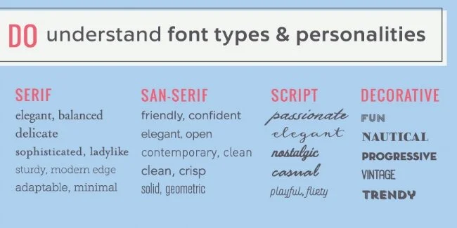
Like color, fonts can say a lot about a person or business. They even have personalities of their own. If you want to dive into this a bit more, this post provides more detail. Otherwise, I’ve got a brief overview of the 4 types of fonts below.
Serif fonts
Serif fonts have those little bitty lines (called serifs) at the ends of the lines that make up the letters. Serif fonts generally are more formal and traditional and can communicate delicacy, beauty, luxury, warmth, respect, dependability, and tradition. They can also say uptight, stufy and old fashioned though.
They're considered to be reader friendly in print but are less so on the web. For digital pieces, they work best as headers, although they can be used for body copy as well if used at a fairly large type size.
San-serif fonts
These types of fonts are inherently more simple than serif fonts because they’ve done away with the serifs. They communicate a message that is straightforward, sensible, clean, contemporary and informal.
They work well in the digital arena as both body copy and headers.
Script fonts
Script fonts include most handwritten fonts, and the messages they communicate can run the gamut from elegance and grace to funky and fun. Generally, they feel more personal and creative. They can be feminine, beautiful, luxurious, soft, delicate, relaxed, quiet, happy and war, to name a few descriptors.
They are not suitable for body copy!
Display & Decorative fonts
While script fonts can be considered decorative fonts, most display and decorative fonts don't fall into the serif or san serif categories. Often, they are custom made and can be super cool and creative. They're usually used to create or reinforce a strong visual theme and can evoke a whole range of emotions. Make sure whatever decorative fonts you use are legible, and don't use them for body copy.
TIP 2 - LIMIT THE NUMBER OF FONTS YOU USE
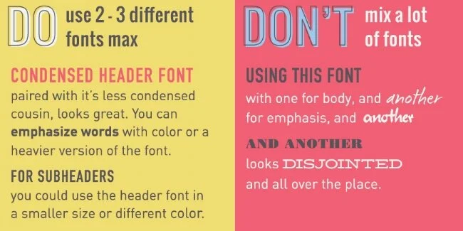
Using too many fonts is a common mistake made by new designers. It usually creates a chaotic and disjoined effect. As a general rule, 2 to 3 fonts are all you should need. Some folks argue that you should use 1 font for your logo and then fonts 2 and 3 for headers/subheaders and body copy respectively. I think you can also use your logo font for headers and subheaders and then 1 other font for body copy.
TIP 3 - PAIR FONTS WISELY
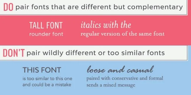
When you're paring fonts, you want to create a cohesive look without using fonts that are too similar. If your fonts look too much alike, readers are likely to think you've made a mistake and used the wrong font.
While you don't want to use fonts that are too similar to one another, you also don't want to use fonts that are wildly different or communicate completely different messages.
Look for fonts that complement each other rather than compete against one another.
I have another post that's all about pairing fonts if you want to dive into that topic more.
TIP 4 - USE ALIGNMENT THOUGHTFULLY
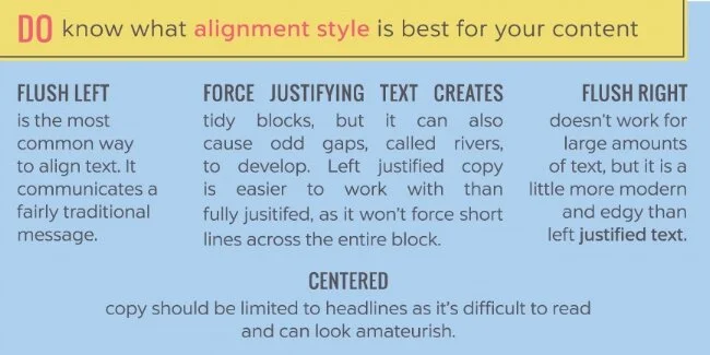
Alignment refers to how your type lines up. There are four ways to align type:
Left-aligned (flushed left)
This is the most common way to align text. It makes for the easiest reading, and communicates a fairly traditional message. Watch out for overly ragged (uneven) lines. The web likes left-aligned text best.
Right-aligned (flushed right)
I often right-align text when I'm trying to communicate that a brand is forward-thinking or ahead of the curve, but it only works with a relatively small amount of text. Otherwise, it's too difficult to read. It works well for headlines or oversized type that's meant to add visual interest.
Center-aligned
For some reason, non-designers seem to gravitate towards center-aligned text, and it can really scream "amateur" if used incorrectly or too much. It's best to limit center-aligning to headlines and subheadlines. It makes body copy difficult to read and makes long headlines look too traditional for my tastes.
Justified (full, left, or right)
Justified means the copy goes all the way to the left and right margins. Full (or forced) justified text does this even on the last line of copy in a paragraph, even if it's only a few words, which can be problematic. Left justified copy solves that problem by making the last line of the paragraph left justified instead of full justified. Right justifying does the same only on the right side.
Newspapers, magazines and books like justified text, as It creates neat blocks and columns that are easy to follow and fits more characters per line. The down side is that it can create visible "rivers" of white space and requires a great deal of manual kerning and letterspacing to make it work. It communicates a relatively traditional message, and doesn't work well for web use.
TIP 5 - USE VISUAL HIERARCHY
One of the worst mistakes you can make with typography is to make all of your type either the same size or too similar in size. Using hierarchy (larger text for headlines, pull quotes, or anything else you want to stand out) helps guide the reader through the copy and allows them to quickly grasp what your text is about and what's most important to know when finished reading.
TIP 6 - DON’T USE UGLY OR CLICHED FONTS
There are a handful of fonts that come standard on most computers and are now ridiculously overused. I would argue that they're also ugly and should be avoided simply because of that, but apparently loads of people disagree with me, because I still see the damn things.
Here they are: Papyrus / Comic Sans / Trajan / Curlz MT
Just don't.
TIP 7 - ADJUST LINE SPACING (LEADING)
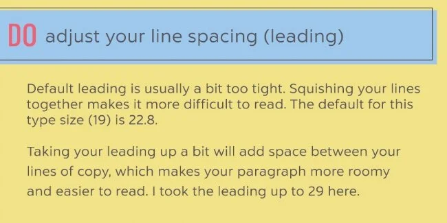
The line spacing that design software typically defaults to is a bit tight, causing your copy to look crowded. The default for 10 pt type, for example, is about 12. I almost always bring that up to at least 14.
Taking your leading up a bit does wonders for readability and airing out your copy, and your entire layout.
TIP 8 - HIGHLIGHT TEXT SENSIBLY
Call out text within a paragraph with one or two, at the most of the following methods:
use a heavier weight version of the font you're using
use italics
use a different color
use a different font (but one you already use for your brand)
use a larger type size
TIP 9 - READABILITY, READABILITY, READABILITY
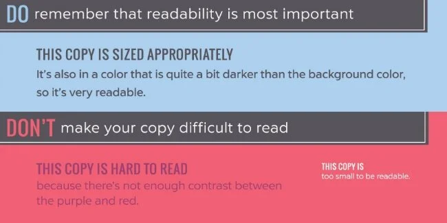
Color text appropriately
Remember that your highest priority is for people to actually read your text, unless you're playing with typography as a strictly graphic element, of course. If viewers can't read the copy because your type size is too small or you put light colored text on a light colored background, you've failed.
Learn about letterspacing
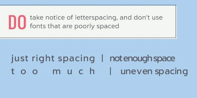
I debated whether to include this or not, because letterspacing is a relatively advanced skill, but I saw a logo recently that made me want to at least mention it. For some reason, it looked like the designer of this logo had made the space between the letters of the business name smaller to the point that it was difficult to read it. It didn't make it impossible, but at first glance, I wasn't sure what it said.
Whatever text you're laying out, be sure to look at it after stepping away for a bit and make sure it's readable. Some fonts, especially cheaper ones, can have funky letterspacing that makes them difficult to read. Either don't use those fonts, or put more space between the letters to improve readability.
The flip side is that if you space letters out too much, your copy becomes equally unreadable, so take care and ask for help if you're not sure!
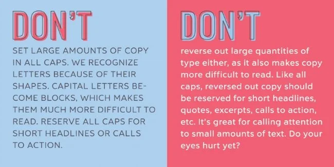
Don't overuse reverse type
Reverse type is light-colored type on a dark background. It's fine for a small amount of copy, but it reduces readability and shouldn't be used for larger blocks of type.
Limit the use of all caps
Setting type in all caps also reduces readability. Letter shapes allow us to decypher text. All caps reduces letters to blocks, making it harder to distinguish between them. Limit your use of all caps to headlines and subheadlines.
There you have it
A true typophile might have a ton more to add to this, but I think this covers some of the most important rules to keep in mind as you create your own designs.
For more information, check out these resources:
The Elements of Typographical Style
Checklist for Better Web Typography
This is just a start. I'll add more as I find good resources. In the meantime, let me know what you think and if you have any questions.


