Powerful Red
The Color Matters website says that “Red is the color of extremes. It’s the color of passionate love, seduction, violence, danger, anger, and adventure.”
Red is one of the top two most favored colors in the world. It’s popular on flags and means “stop” throughout the world.
There are Tomato Reds, which are orange based, and Cherry Reds that are blue based. Red is second only to Yellow in visibility, which is why it’s used on fire trucks and stop signs. It’s an attention-getting color, but it goes a long way and should be used judiciously.
Red is a popular choice for health-related websites like Doctors Without Borders, Project Cure, and The Leukemia and Lymphoma Society. It’s also used for sites focussed on international crises like Save The Children.
Raspberry Red
This bright and attractive red is sometimes called blood red. It’s associated with passion, energy and health. The Hope Heart Institute uses this color throughout it’s website, which makes complete sense for a nonprofit focussed on research and prevention of cardiovascular disease. They pair it with serious, authoritative black, which reinforces the importance of cardiovascular health and positions the organization as an expert on the topic.

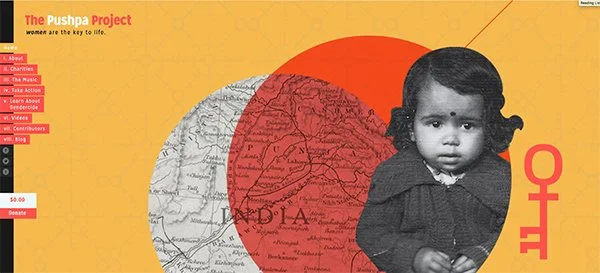
Orange Red
I couldn’t find an “official” red that matched this color. In fact, one site I was on said it’s a pink. I’m including it anyway, because, to me, this is red - a gorgeous, gorgeous red. Plus the site design is fantastic.
According to their website, The Pushpa Project “is a movement to raise awareness to the issue of female infanticide and female foeticide happening in India.” This is a weighty, devastating topic, but the designer of this site has managed to make it accessible and easier to face.
I would argue that part of how they did that was to use a softer, gentler red paired with this butterscotch yellow. Together, they highlight the importance of the issue while still feeling energetic, optimistic and inviting as opposed to alarming and frightening. I suppose some could argue that they should be using a much more alarming red due to the the issue, but I think their instincts were right. They’ll make more progress by inviting viewers in rather than scaring them away.
Is this color red or something else?
Really Great Red
Last but not least is the red I’m currently using in a client’s website. I think this blue-leaning red is about as classic as you can get, but it was also difficult to match, so I’m just calling it Really Great Red.
My client, Women in Consumer Finance, consists of both a resource site and an event for, well, women in consumer finance. The brand colors, black/dark charcoal and red, were already established before I came on the scene.

With that said, I think they’re highly appropriate given that the target market is professional women in the field of finance. While red can have negative connotations when it comes to money, in this instance, it communicates more about power, confidence, and energy than budget deficits.
That’s it for this incredibly powerful and expressive color. There’s no doubt that whatever red you’re using, it’s making a strong statement about who you are and what you stand for!