Easy Tips for Better Designed Marketing Materials
As much as I wish that every non-profit organization out there could afford to hire a professional designer to up their game, I realize that funds are limited, especially for those of you who are just starting out.
With that said, I still believe in my heart that you’ll get better results with all of your materials if they look clean, professional and unique to you and your organization. With that in mind, I’ve compiled some quick and easy tips to help you improve how your marketing materials look.
Tip 1 - CONSISTENCY
No matter what stage of growth you’re in, building brand awareness and recognition is crucial to your success. You want people to know and remember your organization or business, what you do, and how you’re helping the world.
Human beings are very visual, so one of the best ways to build that recognition is by maintaining a consistent look with all of the materials your organization puts out there. And I mean EVERYTHING - not just your website and business card. I’m talking about your social media profiles and posts, your blog posts, your freebies, your forms, etc.
In order to create that consistent look, I recommend that you create a color palette and select a couple of complimentary fonts and use them consistently in all of your materials.:
Color
Color is powerful and communicates a ton about who you are and what you stand for.
Pick a palette of 3 to 6 (max) colors that reflect your brand personality and values and stick to them. You might get bored, but I promise you that no one else will.
Be sure to include two neutrals: one dark for copy and one light for backgrounds.
Check out these blog posts for more information:
HOW TO CREATE A KILLER COLOR PALETTE FOR YOUR BIZ
YOUR BRAND COLORS ARE TALKING: DO YOU KNOW WHAT THEY’RE SAYING?
Fonts
Fonts also say a ton about your organization so pick a couple that communicate your brand personality, and stick with them, too.
Assign roles, like HEADER, SUBHEADER and BODY COPY, to your font selections.
Decide what colors, sizes, weights (bold, regular, light, etc.), case (all caps, sentence case, all lower case) and tracking (space between letters) you’ll use for each type of copy.
Check out these blog posts for more information:
HOW TO PICK THE RIGHT FONTS FOR YOUR BRAND
THE COMPLETE GUIDE TO SUCCESSFUL FONT PAIRING
Design Elements
Examples of additional elements you might want to include in your materials are:
patterns - use one in different colorways for some variety
ICONS - tools you use, meaningful items like flowers, birds, mountains, etc.
BORDERS - great for social media posts
BLOCKS OF COLOR - useful everywhere
GEOMETRIC SHAPES - fun everywhere
Pick one or two strong design elements and use them the same way in all of your materials. Don’t overdo it and pick too many; less is more in design!
Photography
Once you’ve selected your color palette, try to use photos that mirror that palette as much as possible.
And try to stick with a consistent style of photography: dreamy landscapes, crisp and modern, spare with only one element, vintage, high energy and colorful, subject in foreground with blurred background, etc.
Lastly, try to use the same treatment consistently. By this, I mean things like cropping in close, filling half the space with photo and half with color, reversing copy out of a dark section, etc. Whatever you do, stick with it!
Tip 2 - HIERARCHY
Hierarchy in graphic design is when elements of a piece are arranged in a way that makes their importance clear. Hierarchy influences what viewers see first, second, last, etc. when they look at a layout.
Size/Scale
Size is the easiest way to place emphasis on elements. Larger elements draw more attention than smaller ones do.
Scale is the size of an object in relation to other objects. The greater the scale, the more an item will stand out when placed amongst other items.

Typographic scale is important to establish the hierarchy of information you’re providing. If all of your copy, whether it’s a header, body copy, quote, or list, is the same size, nothing stands out as important. If your headers and pull quotes are larger than body copy, readers know to look at those items first.
Color/Contrast
Bright colors draw more attention than duller ones. For example, if a single word or phrase in a sentence is in a bright color, it will stand out.
Contrast is similar to scale in that it refers to how a color looks in relation to other colors on the page. If your colors are all similar in value, everything looks similar, and nothing stands out. If there’s an element on a page that’s in a highly contrasting color, it will draw the eye and stand out as important.

Tip 3 - LESS IS MORE
The best designs are usually pretty spare and minimal, so try to keep your layouts as simple as possible.
Before you begin, choose the most important element that you want viewers to take away from the piece, and make sure that element draws the most attention.
Think about how each additional element supports and enhances the overall design and message. Does it provide balance? Does it help guide the viewer’s eye through
the piece? Then remove anything that doesn’t serve a purpose.
And before you decide you’re finished, take one more thing away.
When you can’t remove anything else without hurting the message or overall design, you can stop.
Tip 4 - SPACE
This relates to Tip 3. When you fill up the space in a piece with too many graphic elements or copy, viewers see a jumble of words and imagery and don’t know where to look first. When this happens, your message is diluted, or worse, completely lost.
Only include what’s absolutely necessary to get your message across to viewers.
Leave enough space between elements so viewers can see them and read them.
And don’t forget to leave enough space around your overall design (also known as padding). Bumping copy and imagery right up to the edge of the page makes viewers really uncomfortable.
This is also super important with photos if you plan to put copy over them. If your photo has lots of little details and color variation throughout, it’s not a good choice for placing copy. Instead, look for photos that have large enough sections that are empty of detail and color variation, so your copy will be readable.
Tip 5 - TYPOGRAPHY
Typography is the often-overlooked, unsung hero of graphic design. It’s not as sexy or noticeable as color, but it can make or break a piece.
It’s also not the easiest aspect of design to learn, but, there are a number of tips that are easy to implement but have a big impact on your overall design..
My top tips are below.
Use fonts that reflect your brand personality
Like color, your font choices communicate a lot about your business, so it’s a good idea to know something about the main font types. I’ve described four main font types below:
SERIF– serif fonts have those little bitty lines (called serifs) at the ends of the lines that make up the letters. They’re more formal and traditional than other font types. They are considered readable in print but less so on screens.
SAN-SERIF – These types of fonts are inherently more simple, clean, contemporary and informal. They work well in the digital arena as both body copy and headers.
SCRIPT – Script fonts include most handwritten fonts and generally feel more personal and creative. They are not suitable for body copy, and I would argue they’re a bit overused.
DISPLAY & DECORATIVE –These fonts are often custom made and can be very interesting and creative. Use them to create or reinforce a strong visual theme.
The moral of the story is that you don’t want to use a buttoned up, serif font if your brand personality is fun, whimsical and casual. Likewise, don’t use a loose and casual script if your business is more formal and structured.
Limit the number of fonts and pair them carefully
Using too many fonts creates a chaotic and disjoined effect. As a general rule, 2 to 3 fonts are all you should need. Some folks argue that you should use 1 font for your logo and then fonts 2 and 3 for headers/subheaders and body copy respectively.
When you’re paring fonts, you want to create a cohesive look without using fonts that are too similar. Fonts that are too similar don’t create enough contrast. Fonts that are too different can communicate different messages and compete with one another.
Use center alignment minimally
Many non-designers default to Center Aligned and Justified copy, both of which make paragraphs hard to read. Center-aligned copy also tends to look amateurish.
I recommend Left Aligning most copy. Right Alignment can be fun and rebellious, but it works best with smaller amounts of copy. Large paragraphs that are right aligned can be difficult to read..
Don’t use ugly or cliched fonts
There are a handful of fonts that come standard on most computers and are now ridiculously overused. They are: Papyrus / Comic Sans / Trajan / Curlz MT Just Don’t!
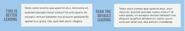
Adjust line spacing (leading)
The spacing between lines of type that software typically defaults to is a bit tight, making copy look crowded. The default for 10 pt type is about 12. I almost always bring that up to at least 14. Taking your leading up increases readability and aires out your copy, and your entire layout.
Highlight text sensibly
Call out text within a paragraph with one or two, at the most, of the following methods:
use a heavier weight version of the font you’re using
use italics
use a different color
use a different font (but one you already use for your brand)
use a larger type size
use ALL CAPS
use a couple of methods at once, but don’t go nuts and use too many at once, making the item overly dominant.
Use enough padding
Be sure to put enough space around your copy so it doesn’t go right to the edge of your piece or background box. Bumping your type right up to the edge not only makes it difficult to read, but, as with pushing elements to the edge of your piece, it also makes your viewer uncomfortable and less likely to absorb your message.

For more help with typography, check out these blog posts:
Want more?
I wrote this post to help non-profit and b corp marketing professionals like you to create better materials. The truth is that people do judge books by their covers, so let’s make sure your materials looks as good as possible, even if you aren’t ready to or can’t hire a designer.
If you’ve given all of this a shot and are thinking it’s time to hire a professional, feel free to drop me an email.