5 Essential Qualities of An Effective Logo
I love graphic design, but, by far, designing logos is what I love the most. There's something about trying to capture and communicate the essence of a business or person in one graphic that gets me super jazzed.
Personally (and professionally, since I'm a designer), I think less is more, when it comes to logos. Are there any hard and fast rules that are accepted industry wide, though? Why, yes, there are, actually, and I've outlined them below.
Most folks know that your logo is one of the most important (but not the only!) elements of a brand. So, it follows that you want your logo to be fantastic, right, but how do you know a good logo from a stinker? Read on, my friend.
A GREAT LOGO SHOULD BE THESE 5 THINGS:
1. SIMPLE
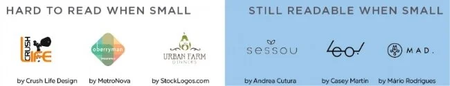
Most designers worth their salt would agree that keeping it simple is the first step to designing a good logo. One of the main reasons for this is that a simple logo is more easily recognizable and, consequently, more memorable.
A simple logo will also read better at very small sizes.
When I was designing a lot of event posters, they usually included a slew of sponsor logos on them. I’d have to make them suuuuper small to fit them all, and lots of them ended up being unreadable.
If you're logo isn't readable at a small size, and you've spent good money on a sponsorship or ad or whatever, you've just thrown that money down the drain, right, because nobody knows who you are.
2. MEMORABLE
A great logo is a memorable logo. Giving your logo a unique twist of some sort will make it memorable. The Leo glasses logo above is such a good example of that. I first saw it weeks ago, and it's stuck with me ever since.
One way to tell if your logo is memorable or not is to think about whether someone could describe it easily after seeing. If they can’t, you might need to change things up a bit.
Keep in mind that not all logos have to include the subject of the business. Some of the best logos don’t say anything about what the company does.
Coca-cola and IBM, two of the most enduring logos of our time, have acquired their meaning through association with those two brands over time and not because they have literal imagery in them.
Ultimately, the only mandate in the design of logos, it seems, is that they be distinctive, memorable, and clear.
-Paul Rand
3. TIMELESS
No business owner wants to have to rebrand after only a few years. Not only is it a pain in the neck, but it can be expensive. Ideally, you want your logo to work for your business until you decide to change your focus or target audience. Hopefully, that'll be years or even decades!
Think about Coca-cola again. Their logo has hardly changed over the years. Their competitor, Pepsi, on the other hand, has changed their logo a ton. Which is the industry leader? Yup - Coke.
It’s easy to get caught up in trends and to want to follow them though. Handwriting and watercolor graphics are all over the place right now, but will they still be all that 10 years from now?
And if you follow a trend at the height of its popularity, you run the risk of being lost in the sea of other, similar logos.
If you want to create a timeless logo, choose your fonts carefully! You don’t want to use the same fonts over and over in your designs, but you do want to choose fonts that are simple and well designed.
Colors also go in and out of style. Neon colors were popular recently, but they quickly got old. Choosing colors based on what they communicate and what's right for you business is a far better strategy than following any existing color trends.
How you treat the logo can also come into play. Incorporating too many graphic styles like gradients or drop shadows can make a logo look dated fast. Here, especially, I say to keep it simple!
Leave trends to the fashion industry. -David Airey
4. VERSATILE
A great logo must be usable across a number of media and applications as well as at different sizes and on different color backgrounds. Logos are placed on everything from websites to billboards to pens, so it’s super important that they be scalable. Professional logo designers always design their logos as vector files because they're scalable to any size. If the designer you've hired doesn't know this or can't do this, you might want to reconsider working with him or her.
A great logo should also work in both horizontal and vertical spaces. Many logo designers will design a logo so that it can be taken apart and reconfigured to fit into different spaces.
I always provide my clients with a number of versions of their logo. One version might have the mark above the text to fit in vertical spaces. Another version will have the text alongside the mark, as this generally fits better in horizontal spaces.
A great logo will also work in a number of different color formats, such as black and white, 2-color, 4-color, and reversed out of a dark color.
Below is an example of a logo that has variations for different spaces and different color backgrounds.

by ithree graphic design
5. APPROPRIATE
Finally, a lasting logo should be appropriate for both the nature of the business and to appeal to the target audience.
A logo for a children’s clothing boutique should be very different from a logo for an adult clothing boutique. Both businesses sell clothes, but their target markets are different, and their logos should be, too.
The fonts, colors, illustration style and configuration of any logo should be carefully selected and crafted to appeal to the target audience.
Obviously, you wouldn't use a childish font with playful imagery for a business that's going for a very serious and professional mood. Likewise, you wouldn't use a script font with a soft, muted color palette for a men's clothing store.
Those are fairly obvious choices, but even the most subtle differences can change the tone of a logo.
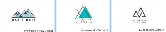
The three logos above all use simple, san-serif fonts, but they all have a different feel. The one on the left is rounder, which I feel is more feminine than font that's more narrow and angular.
Even the different blues change the tone of the two logos on the left. The one on the left feels more feminine to me with its more decorative mountains and softer blue.
The middle logo uses a more gender neutral blue and a more slender font that would appeal to either men or women, The heavier lines and more squarish font makes the logo on the right feel much more masculine.